

Why Most Digital Illustrations From Photo Reference Look Stiff (And How to Fix It)
Working from a photograph is one of the fastest ways to level up as an artist, but it comes with a hidden trap: your finished piece can end up looking like a filtered photo instead of an illustration with personality. If you have ever finished a portrait and thought “technically correct, but soulless,” this tutorial is for you.
Below is the exact 7-step workflow we use at GFX-Art studio to turn a photo reference into a stylized digital illustration that keeps the likeness while adding real artistic voice. We will also cover the ethics of tracing, how to block shapes properly, and where to inject your personal style at each stage.
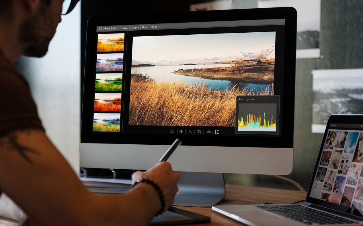
Before You Start: Tools and Mindset
You can follow this workflow in Procreate, Photoshop, Krita, Clip Studio Paint, or Affinity Photo. The software does not matter. What matters is treating the reference as a guide, not a template.
- A drawing tablet or iPad with pressure sensitivity
- A high-resolution reference photo (minimum 2000 px on the long edge)
- Permission to use the photo (your own shot, a licensed image, or a stock photo with the right rights)
- A canvas set to at least 300 DPI at your final print size
Step 1: Choose the Right Reference Photo
Not all photos make good illustration references. A bad reference forces you to fight the image the entire way through. A good reference does half the work for you.
What to look for
- Clear lighting direction – one main light source creates readable shadows
- Strong silhouette – can you recognize the subject as a black shape?
- Expressive pose or gesture – static, frontal snapshots kill energy
- High enough resolution to zoom into skin, fabric, and eye details
What to avoid
- Flat, on-camera flash photos with no shadow information
- Heavily filtered Instagram shots (the colors are already interpreted)
- Blurry or noisy images that hide anatomy
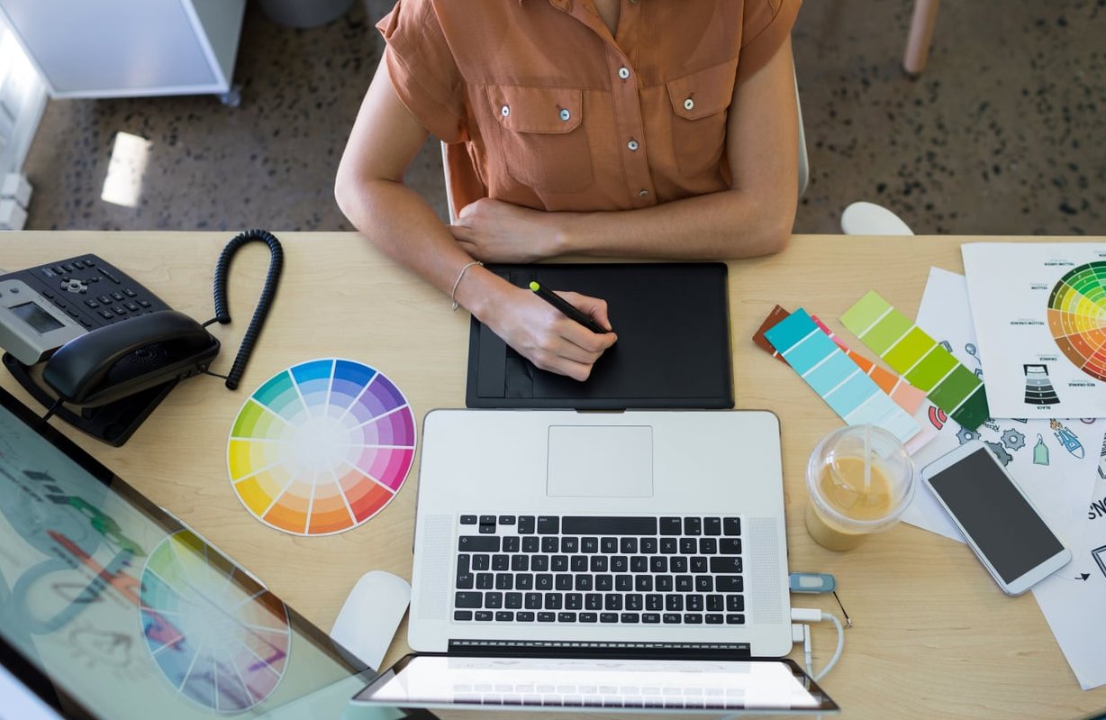
Step 2: Understand the Ethics of Tracing
This debate never dies, so let us settle it clearly.
| Situation | Ethical? |
|---|---|
| Tracing your own photo | Yes, always |
| Tracing a licensed stock photo | Yes, per license terms |
| Tracing another artist’s work | No |
| Tracing a random Pinterest photo and selling it | No |
The old masters used camera obscuras and projectors. Tracing is a tool, not a sin. The real question is whether you own the rights to the source and whether you are interpreting the image or just copying pixels.
Step 3: Block the Big Shapes (Do Not Start With Details)
This is where 90% of beginners kill their illustration. They open the reference, zoom in on an eye, and spend two hours rendering an eyelash before the head shape is even defined.
- Import your reference on a locked layer, lowered to 30% opacity
- Create a new layer above it
- Using a large chunky brush, block the silhouette in one flat color
- On a second layer, block the main shadow shapes in a darker tone
- Squint at your screen. If the shapes read from across the room, you are good
At this stage your illustration should look like a 5-second poster study. That is exactly the point.
Step 4: Simplify and Stylize the Line Work
Now hide the reference and draw on top of your own block-in. This forces your brain to commit to shapes instead of chasing pixels.
Techniques to push your style
- Exaggerate proportions – bigger eyes, longer neck, sharper jaw. Pick a direction
- Simplify hair into 3 to 5 clumps instead of drawing every strand
- Vary line weight – thicker on shadow sides and where forms overlap
- Cut out visual noise – if the shirt has 40 wrinkles in the photo, keep the 4 that matter

Step 5: Build a Custom Color Palette
Never eyedrop directly from the photo. Photo colors are muddy, inconsistent, and shaped by the camera sensor. Instead:
- Pick 3 to 5 base colors that describe the mood you want
- Use warm colors in the light and cool colors in the shadow (or invert it for a stylized look)
- Add one unexpected accent color that does not exist in the photo
- Test the palette by filling all your shape layers before adding any rendering
This single step is what separates a photo-bashed portrait from a real illustration.
Step 6: Render With Intention, Not Imitation
Rendering means adding volume, texture, and light. The trap here is trying to match the reference exactly.
- Use no more than 3 values per surface: base, shadow, highlight
- Keep hard edges where forms turn sharply, soft edges where they turn gradually
- Add texture brushes (grain, halftone, watercolor) to break the digital plastic look
- Do not render everything equally. Push detail on the face and let the rest fall off
Step 7: Add Your Signature Touches
This is the final 10% that makes people recognize your work in a scroll.
- Overlay a subtle paper texture at 15% opacity
- Add hand-drawn imperfections: small ink splatters, sketch marks, tiny doodles
- Slightly shift hues with a Color Balance adjustment layer
- Use a Gradient Map for cinematic color unity
- Sign it. Yes, actually sign it

Common Mistakes to Avoid
| Mistake | Fix |
|---|---|
| Starting with details | Block shapes first, always |
| Eyedropping photo colors | Build a custom palette |
| Rendering everything equally | Focus detail on the focal point |
| Copying every wrinkle and hair | Simplify aggressively |
| Using low-res references | Shoot or license high-res |
Final Thoughts
A great digital illustration from photo reference is not about accuracy. It is about translation. You are the filter between the raw photo and the finished piece, and your job is to leave fingerprints on every step of that translation. Follow this 7-step workflow a few times and you will start feeling the difference between copying and creating.
FAQ
Is it cheating to use a photo reference?
No. Every professional illustrator uses references. What matters is that you own the rights to the photo and that you interpret it rather than trace it pixel by pixel.
Can I sell an illustration made from a stock photo?
Only if the license allows commercial derivative work. Read the license before you start, and when in doubt, shoot your own reference.
How long should a digital illustration from photo reference take?
For a stylized portrait, expect 4 to 10 hours depending on complexity. If you spend more than 2 hours before finishing the block-in stage, you are probably over-detailing too early.
What is the best software for beginners?
Procreate on iPad and Krita on desktop are the two best entry points in 2026. Both offer excellent brush engines and a gentle learning curve.
Should I trace or freehand?
A hybrid works best. Trace the largest proportions to save time, then freehand the rendering. This keeps accuracy without losing artistic feel.
0 Comments