

Most small business websites do not fail because of a bad colour palette. They fail because of a handful of repeatable, fixable errors that quietly send visitors back to the search results. After auditing hundreds of small business sites, we see the same common web design mistakes again and again, and almost all of them can be corrected in a few hours of focused work.
This is not a list of vague advice like “keep it clean” or “be user friendly”. Each mistake below comes with three things: how to diagnose it in under two minutes, why it costs you customers, and the exact fix you or your designer can ship this week.
Quick diagnostic: which mistakes is your site making?
Open your site on your phone, on mobile data (not Wi-Fi), and run through this table before you read the detail.
| Test | Fail signal | Mistake number |
|---|---|---|
| Show your homepage to someone for 5 seconds | They cannot say what you sell or to whom | 1 |
| Find your phone number from any page | Takes more than one tap or scroll to footer | 2 |
| Time the homepage load on 4G | Hero image still blank after 2.5 seconds | 3 |
| Tap the mobile menu | Items overlap, need zoom, or submenus close instantly | 4 |
| Count buttons above the fold | Zero, or more than three competing ones | 5, 6 |
| Read your body text outdoors | Grey on grey, under 16px, lines too long | 7 |
| Look for proof | Only stock photos, no reviews, no real names | 8 |
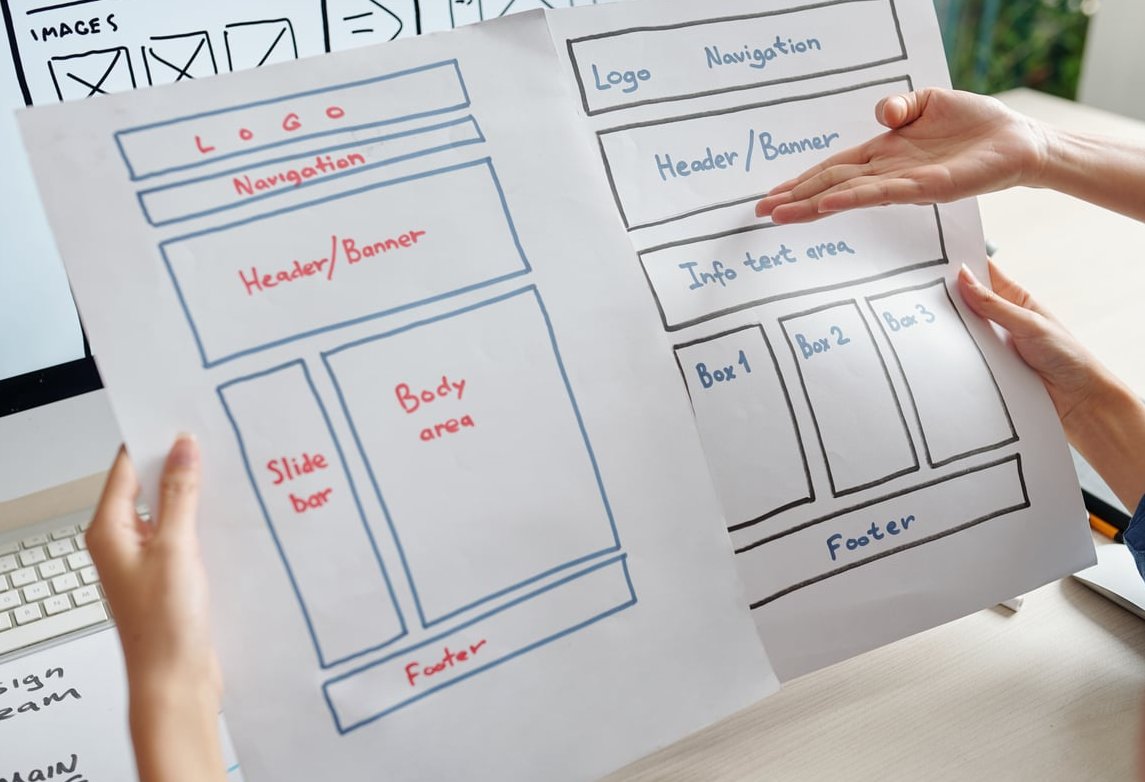
The 11 most common web design mistakes (and how to fix them)
1. A homepage that tries to say everything at once
What it looks like: a sliding carousel with five messages, three paragraphs of company history, a wall of service icons, a news feed and a newsletter box, all fighting for the same screen.
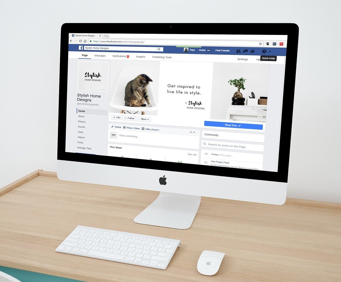
Why it costs you customers: when everything is emphasised, nothing is. A visitor who cannot classify your business in a few seconds does not dig deeper, they go back and click the next result. Carousels make it worse because most people only ever see slide one, so the other four messages are effectively invisible.
Before and after reasoning: before, the hero says “Welcome to our website, quality since 1998” over a rotating slideshow. After, it says “Emergency plumbing in Bristol, on site within 90 minutes”, with one button and one supporting line. Nothing was added, four things were removed. You can read more here.
The fix this week:
- Replace the carousel with one static hero: who you help, what you do, where you do it.
- Limit the homepage to five blocks: hero, proof, services, why you, one clear next step.
- Move company history to the About page. Nobody buys from a timeline.
2. Contact details that are hidden, incomplete or unclickable
What it looks like: a phone number that lives only in a footer image, a contact form with no email or address next to it, no opening hours, no map, and no indication of the areas you serve.
Why it costs you customers: for local businesses, the contact step is the conversion. Missing hours and address also weaken your local search visibility, because search engines cross check the same details on your site, your Google Business Profile and directories.
The fix this week:
- Put a clickable
tel:link in the header on mobile so one tap starts a call. - List name, address, phone and hours as real text in the footer of every page, not inside an image.
- On the Contact page, show at least two ways to reach you plus expected response time (“We reply to all enquiries within one working day”).
- Add a short line about your service area if you travel to clients.
3. Hero images that are far too heavy
What it looks like: a 4.2 MB JPEG exported straight from a camera, served at full width to a phone, sometimes with a video background on top.
Why it costs you customers: the hero image is usually the element that decides your Largest Contentful Paint. If it takes four seconds to appear, a large share of mobile visitors leave before they ever see your offer. Slow pages also compete badly in search.
Before and after reasoning: before, one 4.2 MB image, no dimensions declared, layout jumping as it loads. After, a 140 KB WebP or AVIF file, width and height attributes set so nothing shifts, and no lazy loading on the hero (lazy loading the first image actually delays it).
The fix this week:
- Export hero images at a maximum of 1920px wide and compress to WebP or AVIF, target under 200 KB.
- Serve smaller versions to phones with
srcset. - Set explicit width and height on every image to stop layout shift.
- Drop autoplaying background video on mobile, use a still frame instead.
4. A mobile menu nobody can actually use
What it looks like: a hamburger icon 20px wide, a menu panel that lists 14 items in small grey text, dropdowns that need a precise tap, and a menu that scrolls the page behind it.
Why it costs you customers: the majority of small business traffic is on phones. If the menu is fiddly, visitors never reach the service page that would have sold them.
The fix this week:
- Make every tap target at least 44 by 44 pixels with clear spacing between items.
- Cut the top level to five or six items. Everything else becomes a section inside a page.
- Label the icon with the word “Menu”, it measurably increases use.
- Lock background scrolling while the panel is open, and make the close control obvious.
- Put your primary action (Call, Book, Quote) as a visible button outside the menu, not buried inside it.
5. Calls to action that are vague or invisible
What it looks like: buttons that say “Submit”, “Learn more” or “Click here”, styled in the same grey as everything else, and only one CTA at the very bottom of a long page.
Why it costs you customers: a visitor who is ready to act should never have to hunt. Generic labels also create hesitation because the person does not know what happens next.
Before and after reasoning: before, “Submit” on a low contrast grey button. After, “Get my free quote (takes 2 minutes)” on a high contrast button, repeated after the pricing section and again at the end of the page. Same page, same traffic, different result.
The fix this week:
- Write CTAs in the visitor’s words, starting with a verb and stating the outcome.
- Use one dominant button style reserved only for the primary action.
- Repeat the primary CTA every screen or two on long pages, and add a sticky call or booking bar on mobile.
- Add a reassurance line under the button: no obligation, no card required, reply within one day.
6. Navigation written in company jargon
What it looks like: menu items called “Solutions”, “Our Approach”, “Resources”, “The Studio”. Clever names that mean nothing to a first time visitor.
Why it costs you customers: people scan navigation for the words already in their head. If they searched for “boiler repair” and your menu says “Solutions”, they have to guess, and guessing costs clicks.
The fix this week: rename navigation items to plain, searchable nouns: Services, Prices, Reviews, About, Contact. Create a separate page for each main service instead of one combined page. A page called “Kitchen fitting in Leeds” both converts better and ranks better than a section buried inside “Solutions”.
7. Text that is hard to read
What it looks like: 14px light grey body text on a white background, lines running the full width of a desktop screen, tight line height, and thin decorative fonts for paragraphs.
Why it costs you customers: readers scan rather than read. Low contrast and long lines slow scanning down, and slow scanning means abandonment. It is also an accessibility problem that can expose you to complaints. This overview fills in the gaps.
The fix this week:
- Body text at 16px minimum on mobile, 17 to 19px on desktop.
- Contrast ratio of at least 4.5:1 for body text. Check it with any free contrast checker.
- Line length of roughly 60 to 75 characters, line height around 1.5.
- Break walls of text with subheadings, short paragraphs and bullet lists.
- Reserve display fonts for headings only.
8. Nothing but stock photos and no proof
What it looks like: smiling models in a glass office, a generic handshake photo, and a claim that you are “the leading provider of quality service”. Originally covered on https://tilda.education.
Why it costs you customers: claims without evidence read as noise. Visitors on a small business site are asking a single question: can I trust these people with my money? Stock imagery answers no.
Before and after reasoning: before, a stock team photo and the sentence “We deliver excellence”. After, three real photos of finished jobs, a review with a full name and location, the number of projects completed last year, and any certification logos. Nothing was invented, existing proof was simply put on the page.
The fix this week:
- Shoot 10 honest phone photos of your team, premises or completed work.
- Pull your three best reviews from Google and place one directly beside the main CTA.
- Add specific numbers: years trading, jobs completed, guarantee length, response time.
- Show trust marks that actually apply to you: insurance, trade bodies, certifications.
9. Forms that ask for far too much
What it looks like: eleven required fields, including company size and how you heard about us, plus a captcha that fails twice and no confirmation message after sending.
Why it costs you customers: every extra field is a reason to abandon. Worse, many small business sites never test the form after a plugin update, so enquiries silently vanish.
The fix this week:
- Cut to the minimum: name, contact method, message. Qualify later by phone.
- Mark optional fields clearly and keep labels above inputs, not inside them.
- Show inline error messages that say what to correct, not a generic red box.
- Add a real thank you page with next steps, and send an auto reply.
- Send yourself a test enquiry today, then set a monthly reminder to repeat it.
10. Popups and interruptions that fire too early
What it looks like: a newsletter overlay two seconds after arrival, a chat widget that opens by itself, a cookie banner covering half the screen, and a discount wheel on top of it all.
Why it costs you customers: the visitor has not read a single sentence and is already being asked for something. Intrusive interstitials on mobile can also damage your search performance.
The fix this week:
- Delay any popup until the visitor has scrolled 50 percent or spent 30 seconds on the page.
- Never stack two overlays. Cookie consent first, everything else after it is dismissed.
- Keep chat widgets closed by default and small enough not to cover CTAs on mobile.
- Make the close button large and obvious, and remember the dismissal.
11. Pages that end in a dead end
What it looks like: a blog post or service page that simply stops, with no related links, no CTA and no next step. Or worse, broken links and an unstyled 404 page.
Why it costs you customers: interest is highest at the end of a page someone actually read. If you offer nothing there, that interest evaporates.
The fix this week:
- End every page with one relevant action and two internal links to related pages.
- Design a helpful 404 page with search, main navigation and contact details.
- Run a free broken link check and fix or redirect anything that returns an error.
- Make sure every service page links to the contact or booking page in the body text, not just in the menu.
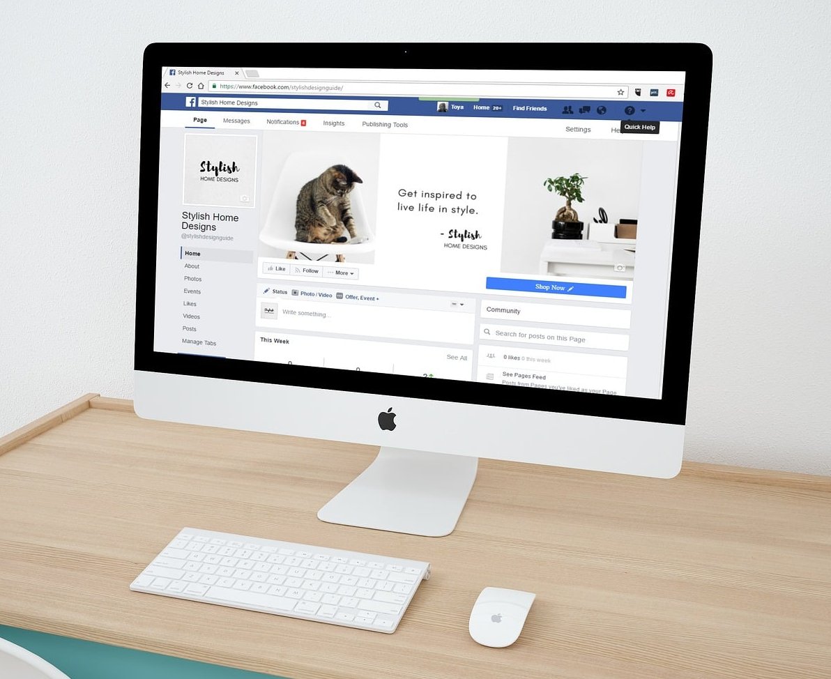
How to prioritise the fixes
If you can only spend one day on your site, work in this order. The table ranks the fixes by impact against the effort required.
| Priority | Fix | Typical effort | Expected impact |
|---|---|---|---|
| 1 | Test the contact form, add clickable phone number | 30 minutes | Very high |
| 2 | Rewrite the hero message and main CTA | 1 to 2 hours | Very high |
| 3 | Compress hero and gallery images | 1 hour | High |
| 4 | Fix mobile menu tap targets and labels | 2 hours | High |
| 5 | Add real photos and three reviews | Half a day | High |
| 6 | Raise text size and contrast | 1 hour | Medium |
| 7 | Delay or remove popups | 20 minutes | Medium |

A 20 minute audit you can repeat every quarter
- Load the homepage on a phone using mobile data and count the seconds until the main image appears.
- Ask someone outside your business what you sell after five seconds of looking.
- Try to book, call or enquire using only your thumb. Note every point of friction.
- Check text contrast and size on a screen in daylight.
- Submit the contact form and confirm the message arrives in the inbox you actually read.
- Open the site in a private window to see the popup experience a new visitor gets.
- Click every navigation link and look for errors or empty pages.
Write the friction points down as a list of tasks. Most sites we audit have between six and nine of the eleven mistakes above, and the majority are fixed within a week without a redesign.

Frequently asked questions
What are the most common web design mistakes on small business websites?
The recurring ones are a cluttered homepage with no clear message, hidden contact details, oversized hero images that slow the page down, an unusable mobile menu, weak calls to action, jargon based navigation, low contrast text, stock imagery with no proof, overlong forms, aggressive popups and pages that end without a next step.
What is the 3 second rule in web design?
It is the idea that a visitor decides within roughly three seconds whether a page is relevant to them. In practice it means your hero area must answer three questions immediately: what you offer, who it is for and what to do next. It also applies to speed, since a page that has not rendered anything useful in three seconds is often abandoned.
What are the 7 C’s of website design?
They are commonly listed as context, content, community, customisation, communication, connection and commerce. For a small business site, the practical takeaways are: keep the layout and visual context consistent, publish content that answers real customer questions, make communication effortless, and connect pages so visitors always have a logical next step.
Do I need a full redesign to fix these mistakes?
Usually not. Nine times out of ten the structure is workable and the problems are in messaging, images, navigation labels and calls to action. A redesign becomes worthwhile when the site is not responsive at all, when the platform blocks basic performance fixes, or when the business has changed so much that the content no longer matches what you sell.
How often should I check my website for these issues?
Run the 20 minute audit once a quarter, and always after a theme, plugin or platform update. Forms and speed are the two things most likely to break silently after an update.
Which mistake costs the most money?
A broken or hidden contact path. Every other error reduces conversion rates gradually, but an enquiry form that does not deliver, or a phone number that cannot be tapped, wastes every visit you paid for.
Need a second opinion on your site?
If you would rather have someone else run the diagnosis, our team reviews small business websites against this exact checklist and returns a prioritised list of fixes with before and after mockups. Get in touch and tell us which of the eleven mistakes you already suspect you are making.
0 Comments