
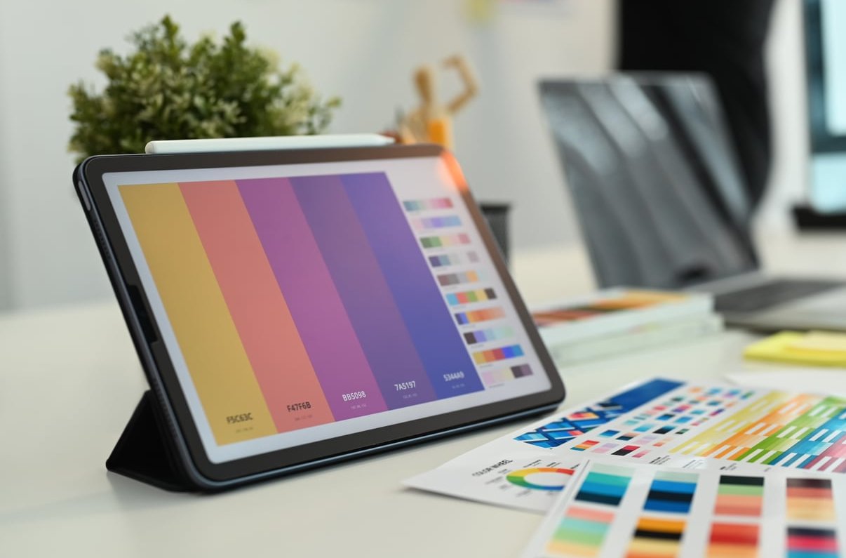
Most guides on how to design product packaging stop at mood boards and color psychology. That is the easy half. The half that actually costs money is the other one: a dieline that folds correctly, legal copy that sits where regulators expect it, a barcode that scans, and a PDF that a printer accepts without sending it back three times.
This is the workflow we use at gfx-art.org for a small-brand folding carton, from the first structural file to the final upload. Nine steps, in the order a real designer works through them, with notes on what printers reject and why.
Before You Open Illustrator: The 10-Minute Brief
You cannot design a box without knowing what goes inside it and who picks it up. Write these answers down before anything else:
- Product dimensions and weight (measured, not estimated) including any inner bag, bottle or tray.
- Sales channel: retail shelf, e-commerce shipping, market stall, or all three. An e-commerce box takes impact; a shelf box takes attention.
- Run length: 250 units behaves nothing like 25,000 units. Short runs go digital, long runs go offset or flexo, and that decision controls your color options.
- Regulatory category: food, cosmetics, supplements, toys, electronics and candles all carry different mandatory copy.
- Budget per unit, including finishing. Soft-touch lamination plus foil can double a carton price.
Every later decision traces back to this brief. Skip it and you will redesign the panel layout halfway through.

Step 1: Choose the Structure Before the Graphics
Structure is packaging. Graphics are decoration applied to structure. Pick the format first. There is a practical rundown of it online.
| Structure | Best for | Watch out for |
|---|---|---|
| Straight tuck end (STE) | Cosmetics, supplements, light retail goods | Both flaps open the same way, so the back panel shows a flap seam |
| Reverse tuck end (RTE) | Cheapest general-purpose carton | Flap seams appear on both front and back |
| Auto-bottom / crash lock | Heavier products, fast hand-packing | More board, higher die cost |
| Two-piece rigid box | Premium, gifting, electronics | Wrap artwork, not flat artwork. Different file logic entirely |
| Mailer (E-flute corrugated) | Direct-to-consumer shipping | Fluting shows through heavy ink coverage |
| Pouch / flexible film | Coffee, snacks, powders | Seal zones are unprintable; the gusset distorts artwork |
Rule of thumb: add 2 to 4 mm of clearance around the product inside the carton, more if there is an inner liner. A box that fits perfectly on screen does not fit in reality once board thickness (caliper) is accounted for.
Step 2: Get the Dieline From Your Printer, Not From a Template Site
This is the single biggest time-saver in the whole process. Generic dielines downloaded from template libraries are built for generic board. Your printer’s dieline accounts for the exact caliper, glue tab width, and tool they already own.
What a correct dieline file contains
- Cut lines as a solid stroke, usually in a named spot color such as Dieline or CutContour.
- Crease / fold lines as a dashed stroke in a second spot color.
- Perforation and glue areas marked separately.
- Everything sitting on its own locked top layer, set to overprint, and removed or disabled at export (your printer will tell you which).
Document setup that prevents 90% of rejections
- Work at 100% scale in millimetres or inches, never scaled down.
- Set the document color mode to CMYK from the start. Converting RGB artwork at the end shifts every color.
- Place raster images at 300 ppi at final size. Logos stay vector.
- Build a layer stack:
Dieline(top, locked) /Legal Copy/Artwork/Background. - Add 3 mm bleed on every outer edge of the flat shape (printers in the US commonly ask for 0.125 in).
- Keep critical text and logos at least 4 to 5 mm inside every fold and cut line. Folding carton registration is not surgical.
Step 3: Map Panel Hierarchy Before You Design Anything
A box is not one canvas. It is five to seven canvases that are seen in sequence. Print the flat dieline, fold it in paper, and label each panel by hand. Then assign a job to each one.
| Panel | Job | Typical content |
|---|---|---|
| Front (Principal Display Panel) | Stop and identify in under 3 seconds | Brand mark, product name, variant, net quantity, one key claim |
| Back | Convince and comply | Description, ingredients, barcode, manufacturer address, warnings |
| Left side | Instruct | How to use, dosage, storage |
| Right side | Reassure | Certifications, recycling marks, brand story, QR code |
| Top flap | Shelf visibility from above | Logo, variant color block |
| Bottom flap | Traceability | Batch code zone, best-before zone, SKU |
| Inner surface | Unboxing moment (optional) | Pattern, thank-you message, reorder code |
The 3-second front panel test
Export the front panel as a flat JPG, shrink it to 300 px tall, and look at it from two metres away. You should be able to answer: what brand is it, what is the product, and which variant? If you cannot, the hierarchy is wrong, not the typeface.

Step 4: Place Mandatory Legal Copy Early, Not Last
Designers who leave compliance copy for the end always end up shrinking the beautiful part. Block out the legal zones in grey rectangles during layout, then fill them in.
The usual requirements
- Product identity and net quantity on the front panel, net quantity usually in the bottom 30% of the panel.
- Ingredient list in descending order of weight, with allergens emphasised (bold or caps) for food.
- Name and address of the responsible operator in the market where you sell. For the EU this means an EU address; for the UK, a UK address.
- Country of origin.
- Durability or period-after-opening: best-before date for food, the open-jar symbol for cosmetics.
- Batch or lot number zone, usually left blank and inkjetted at filling.
- Warnings and safety symbols for anything flammable, choking-hazard sized, or age-restricted.
- Recycling and disposal marks, which are increasingly mandatory rather than decorative.
- Barcode (EAN-13 or UPC-A).
Minimum sizes you should not fight
- Mandatory text generally needs an x-height of at least 1.2 mm under EU food rules. Set it larger. 6 to 7 pt with generous leading reads better than 5 pt crammed.
- Barcodes: print at 80% to 200% magnification, keep the quiet zone clear on both sides, and use 100% K black bars on a white background. Never build a barcode from four-color black and never put it on a dark, metallic or transparent panel.
- Reversed-out small type under 7 pt on a four-color background will fill in. Use a single ink background instead.
Important: a designer lays out compliance copy, a regulatory specialist or the brand owner approves it. Always get written sign-off on the legal panel before release. The subject deserves a deeper dive than we can give it here.
Step 5: Build the Visual System
Now the fun part, with constraints already in place.
- Color: decide early whether you are CMYK, CMYK plus one or two spot inks, or spot-only. A brand color that lives outside the CMYK gamut (most vivid oranges, deep blues and greens) needs a Pantone spot ink or it will print dull.
- Variant coding: if the range has flavours or scents, lock a system now: same layout, one changing color field and one changing icon. It makes future SKUs a 30-minute job.
- Typography: two families maximum. One display face for the name, one highly legible face for the back panel at small sizes.
- Imagery: photograph or illustrate the product in use. On a carton, a product photo must survive at 40 mm wide.
- Ink coverage: keep total area coverage under roughly 300% on coated board and lower on uncoated. Heavy full-bleed solids also scuff at the folds.
Step 6: Choose Material and Finish (This Changes the Artwork)
Material is not a final-step preference. Uncoated kraft absorbs ink and darkens everything by 10 to 15%, so artwork built for gloss coated board looks muddy on kraft.
| Substrate | Look | Design implication |
|---|---|---|
| SBS / FBB white board (300 to 400 gsm) | Clean, bright, retail standard | Full color freedom, best photo reproduction |
| Kraft / recycled board | Natural, earthy | Use 1 to 2 solid inks, avoid photos, expect color shift |
| E-flute corrugated | Sturdy, shipping-ready | Avoid fine lines and large flat solids; fluting telegraphs |
| Rigid board with wrap | Premium, gift-level | Artwork must allow for wrap turn-in and corner stretch |
Finishes, and what each one costs you
- Gloss lamination: cheap protection, boosts contrast, shows fingerprints less than soft touch.
- Matte / soft-touch lamination: premium feel, mutes color by around one tone, scuffs visibly on dark solids. Pair with spot UV for contrast.
- Spot UV or spot gloss: needs its own 100% K vector layer named clearly. Keep shapes above 1 mm thick.
- Hot foil: also a separate vector layer. Avoid hairlines and tiny serifs; foil fills and bridges.
- Emboss / deboss: separate layer, needs a minimum stroke width and clear space from folds.
- Varnish-free zones: required where you will later apply a label or inkjet a batch code. Mark them.
Step 7: Build a Physical White Mockup
Print the flat artwork at 100% on A3, cut it, score it with a bone folder, glue it, and put the actual product inside. Ten minutes of work that catches:
- Panels that read upside down once folded.
- Copy that disappears under a tuck flap.
- A barcode that lands on a crease.
- A box that is 3 mm too tight for the product.
- Side panels that are too narrow for the ingredient list.
For a longer run, pay for a printed and die-cut proof from the actual printer on the actual board. It is the cheapest insurance you will ever buy against a 10,000-unit mistake.
Step 8: Pre-Flight Like a Printer Would
Here is where most jobs stall. These are the rejection reasons that come up again and again, and the fix for each one.
| Why printers reject the file | Fix |
|---|---|
| No bleed, or background stops at the cut line | Extend all backgrounds 3 mm past every outer edge, including flaps and glue tab |
| RGB or Lab images embedded in a CMYK file | Convert everything to the printer’s CMYK profile before export |
| Stray or unused spot colors in the swatch panel | Delete unused swatches; keep only the spots you are actually paying for |
| Duplicate spot names (PANTONE 032 C vs Pantone 032C vs Red) | Standardise one exact name across all linked files; duplicates generate extra plates |
| Missing or unembedded fonts | Embed fonts in the PDF, or outline text once copy is final sign-off |
| Low-resolution images | 300 ppi at placed size; 600 ppi for line art and 1-bit images |
| Rich black small text or black built as 4 colors | Small text 100% K only; rich black reserved for large solids |
| Dieline printed as artwork | Dieline on its own spot-color layer, set to overprint, flagged as non-printing |
| Hairlines and strokes under 0.25 pt | Minimum 0.25 pt for single-ink lines, thicker for reversed lines |
| Transparency and live effects not flattened for an older RIP | Export PDF/X-4 if supported, PDF/X-1a flattened if not |
| Total ink coverage over the press limit | Check with ink coverage preview and reduce heavy shadows |
| Artwork scaled or rotated relative to the supplied dieline | Never move the dieline. Build around it at 100% |
Step 9: Export the Print-Ready File
The final file is a document, not an image. Here is the standard package to send.
- Format: PDF/X-4 (or PDF/X-1a if the printer asks for flattened). One page per SKU, or a multi-page PDF with clear page labels.
- Bleed: 3 mm on all sides, with crop marks offset so they do not sit inside the bleed.
- Color: CMYK plus named spot colors exactly as quoted. Confirm your output intent profile with the printer.
- Dieline: included on a named spot layer set to overprint, so the printer can verify registration. Confirm whether they want it kept or stripped.
- Finishing layers: spot UV, foil, emboss and varnish-free zones each as a separate named spot plate in 100%.
- Fonts: embedded or outlined.
- File naming:
Brand_Product_SKU_Size_v03_PRINT.pdf. Version numbers prevent the classic “we printed v2” disaster. - Supporting files: packaged native file (AI or INDD) with links and fonts, plus a flat JPG visual for approval.
- A short spec note: substrate, gsm, inks, finishes, quantity, delivery date. One paragraph saves five emails.
The last check before you hit send
- Open the exported PDF in Acrobat and use Output Preview to toggle each separation on and off.
- Confirm the plate list matches what you are being charged for.
- Scan the barcode from a printed proof with a phone app. If a phone cannot read it, a till scanner may struggle too.
- Proofread the legal panel out loud, backwards, with a second person. Typos on packaging live for the whole print run.

Common Mistakes That Cost Small Brands Money
- Designing the box before measuring the product. Always the most expensive error.
- Using a downloaded template with the wrong caliper. The box will not close properly.
- Treating finishing as a surprise upgrade. Quote it at brief stage.
- Ordering the maximum quantity on a first run. Regulations, formulas and claims change. Order a run you can sell through in six to nine months.
- Judging color on a screen. Ask for a hard proof or a press check.
- Ignoring the shipping test. A beautiful carton that arrives crushed is a failed design.
Software: What Each Tool Is Actually For
| Tool | Use it for |
|---|---|
| Adobe Illustrator | The industry default for dielines and carton artwork |
| Adobe InDesign | Heavy multilingual back panels and large SKU ranges |
| Affinity Designer | Solid low-cost alternative; confirm spot color handling with the printer |
| Esko ArtiosCAD / Studio | Professional structural design and 3D folding simulation |
| Blender or Dimension | Photoreal mockups for pitching and listings only |
| Canva | Labels, hangtags and inserts. Not reliable for spot colors or dielines |
Quick Reference Checklist
- Brief written, product measured, run length decided
- Structure chosen and clearance confirmed
- Printer dieline received, document set up in CMYK at 100%
- Panel hierarchy mapped on a folded paper model
- Legal zones blocked out and filled
- Visual system and variant coding locked
- Substrate and finishes selected and quoted
- Physical mockup built and tested with the real product
- Pre-flight passed and print-ready PDF packaged and named
FAQ
What software is used for packaging design?
Adobe Illustrator is the standard for dielines and carton artwork, with InDesign used for text-heavy or multilingual back panels. Structural specialists use Esko ArtiosCAD. Canva can handle simple labels and hangtags but does not manage spot colors, dielines or PDF/X output reliably enough for a production carton.
How much bleed does product packaging need?
Three millimetres on every outer edge is the common standard in Europe, and 0.125 inch in the US. Some corrugated printers ask for more. Always confirm with the printer before building, because adding bleed afterwards means reworking every background edge.
Do I need Pantone spot colors?
Only if your brand color falls outside the CMYK gamut, if you need exact color consistency across multiple print runs and suppliers, or if you are printing a one or two color job where spot inks are cheaper than full process. Each spot color adds a plate and therefore cost.
How do I make a packaging box from scratch?
Measure the product, add 2 to 4 mm clearance, choose a structure such as a reverse tuck end, request a dieline at those internal dimensions from your printer, design within it at 100% scale, build a paper prototype to verify the fold, then export a print-ready PDF with bleed and the dieline on its own spot layer.
How long does a packaging design project take?
For a single small-brand carton, roughly two to four weeks of design and revisions, plus one to two weeks for proofing, and two to five weeks for production depending on finishing. Regulatory review for food, cosmetics or supplements can add several weeks, so start it in parallel rather than at the end.
What is the most common reason a printer rejects packaging artwork?
Missing bleed, followed closely by RGB images left in a CMYK document and stray spot colors in the swatch panel. All three take minutes to fix at setup and days to fix once the job is in the queue.
Final Word
Knowing how to design product packaging properly is 20% aesthetics and 80% discipline: the right dieline, a clear panel hierarchy, legal copy placed early, materials chosen with their color behaviour in mind, and a file that passes pre-flight the first time. Work in that order and your printer becomes a partner instead of a gatekeeper.
Need a dieline built, an existing artwork file pre-flighted, or a full carton range designed? Get in touch with the gfx-art.org team and send us your product dimensions to start.
0 Comments